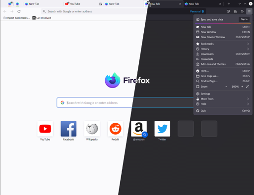
Not a new article (from 2022), but quite interesting.
Am I the only one who actually likes Proton? Maybe I’d take the tab style and the circle back button from Photon, but everything else I really like about Proton.
Legitimately miss 3.5, to this day. Peak functionality.
I have been using Firefox since before it was called Firefox, and I’m not sure I’ve ever been happy after an update.
- Inconsistent icon size and texture
No! DISTINCT icon size and texture! Not a row of generic ultra-light squiggles, all the same color, conveying nothing until you look straight at them. The back button is fucking enormous because it’s obviously what you’ll use most. Stop and reload are weird and discouraging. There’s a reason all your plugins use different colors - that’s what icons are for, god dammit!
Complexity is a feature. Visible similarity conveys semantic similarity! 4.0 just took all the nested functionality and swept it behind a button.
I miss 3.5, and I hate the current Chrome-lite design. I want tabs underneath my address bar.
You can still do this in Waterfox, FYI.
I’ve not used Firefox in years (just various forks), specifically because of Mozilla’s insistence on changing the UI and not allowing you to change it back.
I’d never thought of using Waterfox. Instead, most of my browsing is Pale Moon & SeaMonkey. Are there any good guides to making Waterfox look like a serious browser?
I miss Australis.
Photon was pretty great in hindsight, too.
Proton was such a step in the wrong direction
Funny thing is, i’ve had this userchrome.css ever since 2017.

Mozilla designers slowly get closer.
What does “abstraction” mean in this context
My Firefox chrome never looked much like any of those. I remember when the “classic” theme came along in 2011 and everyone praised it for being more compact and efficient, I was already long-accustomed to an even more compact layout that takes up very little vertical space and is still very similar to how I have it set up today.
From a user’s point of view customisation of the UI has gotten slightly more difficult over the years, but it’s still not that much trouble and so far it’s always been worth the effort.
Mozilla is too bad no more. It became some kind of weird AI company. Believe me, Firefox is not the future anymore. Try to go to a fork asap, now you still can.


