Every so often the Earth produces a signal that is impossible to ignore. This graph is one of them. It shows sea-surface temperatures in the Niño 3.4 region of the equatorial Pacific, one of the most important parts of the Earth's climate system. Each blue line represents a different year since 1982. The red line is this year. It doesn't just set a new record. It has departed entirely from the range of previous observations.If this graph represented stock market prices, a new Olympic record or a

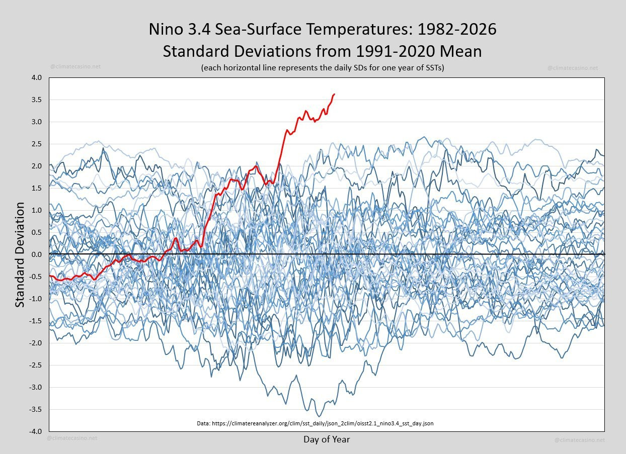
The baseline stopped in 2020. “Standard deviations from the 1991-2020 mean” The standard deviation is of course dependant upon how many samples (30 per day)are in the data set. The only reason I qualified my statement is we don’t have the actual historic data to say without qualification, and if you went back to the Jurassic or further, who knows with any certainty what to compare with (tectonics at some point mean that the area in question didn’t exist). The data certainly is indicative that the baseline data would be significantly lower, but we cannot say that with the authority that we can for the data collected by satellites which is definitive and pretty much unassailable.