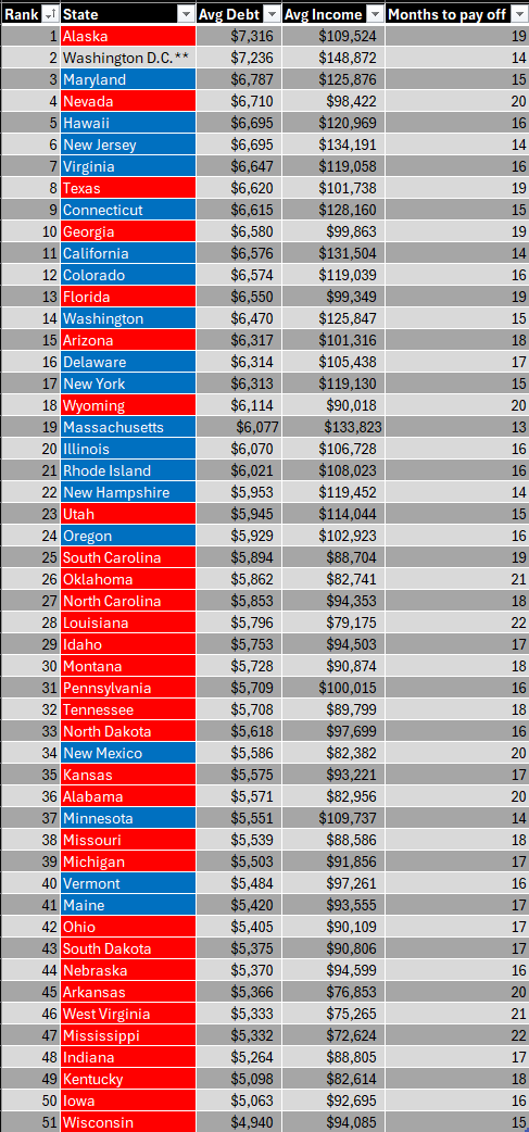
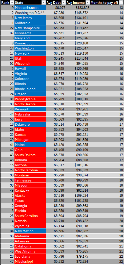
It’s interesting that if you sort it by rank, you see that a lot of blue states are at the top of the list, seemingly meaning that blue states have more debt, however, that is only half the story. When you sort by the “Months to pay off”, then you see that blue states have a higher income to debt ratio, and it is the red states that are in trouble with their debt.


This is the actual analysis the infographic should present. The ratio of income to debt is more revealing. All of Alabama can be up to their eyes in debt and this would miss that fact simply because their average income is lower.
Simply having dollar figures means practically nothing other than for a few smooth-brained people to look at the state where they live, see a number that isn’t as much as they owe, and sigh that it could be worse.
It’d be interesting to see the debt as a percentage of average income for each state. I bet that’d make Alaska look even worse than it already looks.
This, and also mean income is trash in our 2024 world of dystopian wealth disparity. Even income has its limits as the .001% earn their money through non-wage means which may have been left out of the data set completely though hard to know.
deleted by creator
I guess I could do the math of average income and average debt to figure out the percentage, but that table doesn’t “literally” show it. Also, I meant a visualization. When dealing with 50 states and DC it’s easier to quickly see the disparities than sorting and scrolling a table.
How are so many people accumulating so much debt? Do they just fall for the trap of “free money” or what? It is not the median, but I doubt that it would be much better. So all of those people being poor does not add up, that would mean ~~half are poor but wiki lists 40 million. Are many of those actually for big stuff like a car or whatnot instead of small things that I connect with credit cards?
Are many of those actually for big stuff like a car or whatnot
If you’re paying for things like a car with a credit card then I’m not sure what to tell you.
I paid for the car I got from a government auction with a credit card! Paid it off before interest could kick in though. It did feel odd when I was paying.
I am asking what these people do with it. But I do not know, I do not understand that on a fundamental level, like how anyone can vote Trump. Hence I ask. If you know it please share this knowledge.
Well, from the point of view of someone that had credit card debt at one time I’ll tell you my thought process.
I want that thing and I can probably afford another $20 a month. Then repeat.


